Overview
This article will demonstrate how location-based techniques typically used on horizontal linear infrastructure construction projects (Such as Highways, Railways or Tunnels) can also be applied to vertical high-rise building projects, to graphically represent project schedules in Time Location format.
Vertical high-rise building construction is typically a series of trades or disciplines of work progressing vertically through the floors of the building, the elevation (or Relative levels, RLs) of the floors can be treated as discrete linear locations, analogous to the continuous linear locations of those horizontal projects mentioned earlier.

Traditional representations of a high-rise building project schedules use Gantt or Bar charts with time for the horizontal axis, and the vertical axis represents a form of Work Breakdown Structure, such as floors, trades etc.
Time Location charts can use the elevation/relative levels of a building’s floors as the vertical axis, and time as the horizontal axis. The main grid area represents the schedule tasks succinctly indicating where and when they occur.

The benefits offered for schedule communication and analysis for a high-rise building project schedule in this format include:
A concise, visual and easy to understand representation of an entire project schedule on one page
Clear indication of the scheduled rates of progress for varying construction elements and trades as they progress along the building elevation.
A quick and easy check/validation of schedule logic to ensure no errors or clashes exist

Turbo-Chart for High-Rise Building Time Location Charts
To present a vertical high-rise building schedule in time location format, append the following information to the schedule:
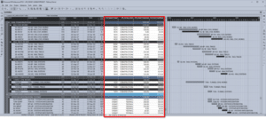
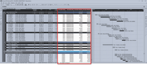
- Schedule tasks associated with any floor are given the start and end Elevation / Relative Levels. A and B below.
- The second step is to define how to represent the different construction elements of trades on the time location chart, assigning codes to schedule tasks that are then used to define the chart shapes, colors etc., shown as C below:

Additional data appended to schedule tasks
All remaining information required to produce the chart, start and finish dates for tasks, is already available from the scheduling data.
Turbo-Chart imports the data from scheduling tools such as Primavera P6, MS Project, or any spreadsheet ready data source. Each shape code is only required to be customized once, or can re-use shape libraries previously developed, to produce a time location chart.

Further customization of the chart can be made to include text or graphic annotations, filtering for selected tasks, limiting date ranges, or creating multiple charts. Turbo-Chart can also use multiple sets of data to create schedule comparisons, such as baseline vs current.
Charts can be customized to display filtered location or date ranges

Chart focused on the tower sequence

Chart focused on the tower foundation works.
As a project schedule is updated, Turbo-Chart can be synchronized to update the Time Location chart almost instantly, comparisons between previous schedules, or other schedules can also be displayed allowing analysis of the changes.

Turbo-Chart comparison between Schedule updates.
[/et_pb_text][/et_pb_column][/et_pb_row][/et_pb_section]


