Turbo-Chart v1.3.2 Features
The latest release of Turbo-Chart includes improvements to the way Turbo-Chart displays critical tasks. The full set of changes is listed on our change log . This article provides an overview of the new criticality features
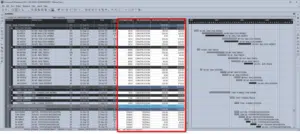
Displaying Critical for Datasets
Previous releases of Turbo-Chart only displayed Criticality on the main dataset. v1.3.2 now lets users select displaying critical tasks on additional datasets being displayed.
A potential use case for this demonstrating the critical path on baseline schedules and how the critical path has varied between different versions of the schedule

Criticality Display Options
In addition to selecting the datasets to display criticality, how this criticality is displayed can also now be configured:
- Color to be used to highlight critical tasks
- The line thickness applied to critical tasks
- The level of Opacity (Transparency) to be used – useful if shapes are defined by line colors themselves.

Criticality Options Video
The following video provides an overview of the criticality options introduced in v1.3.2
This video provides a brief overview of these options.